INTRODUCING THE BORDEAUX COLOUR PALETTE
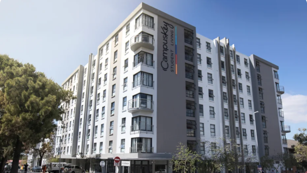
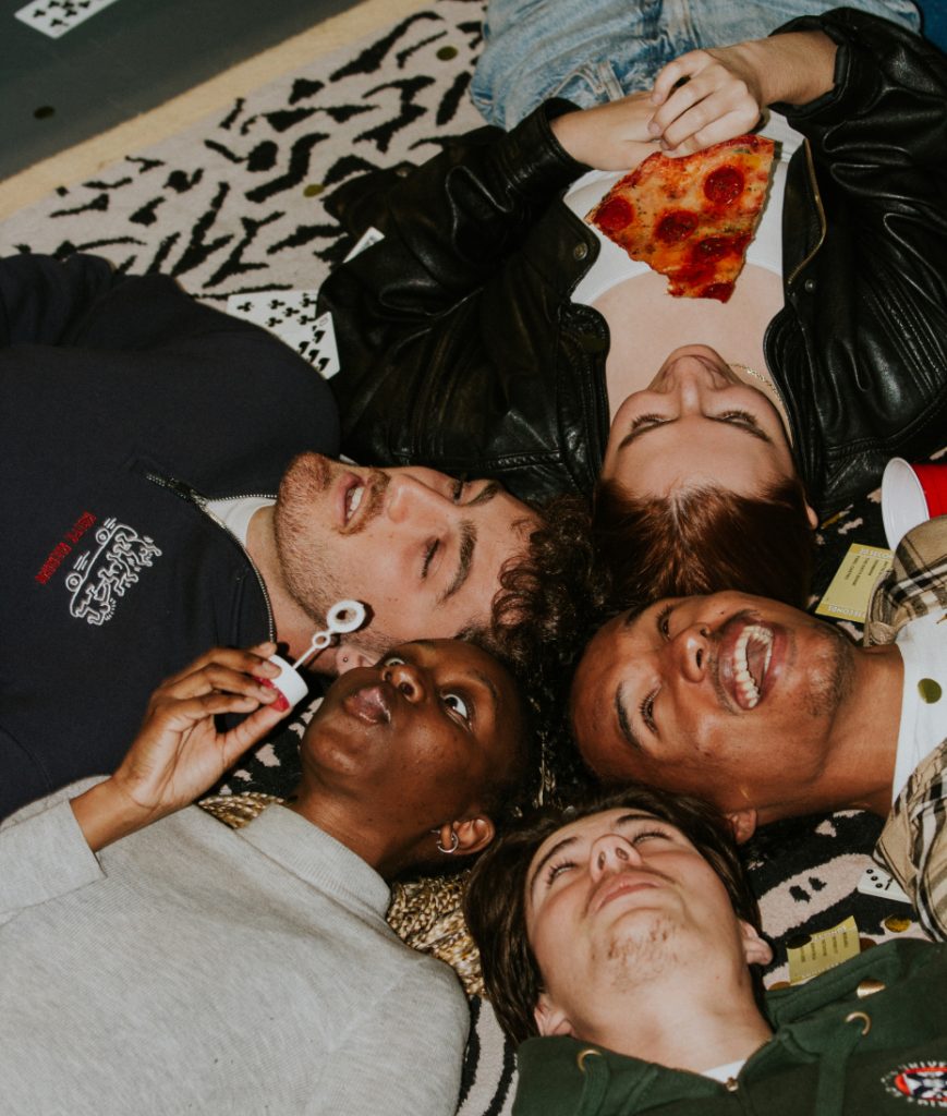
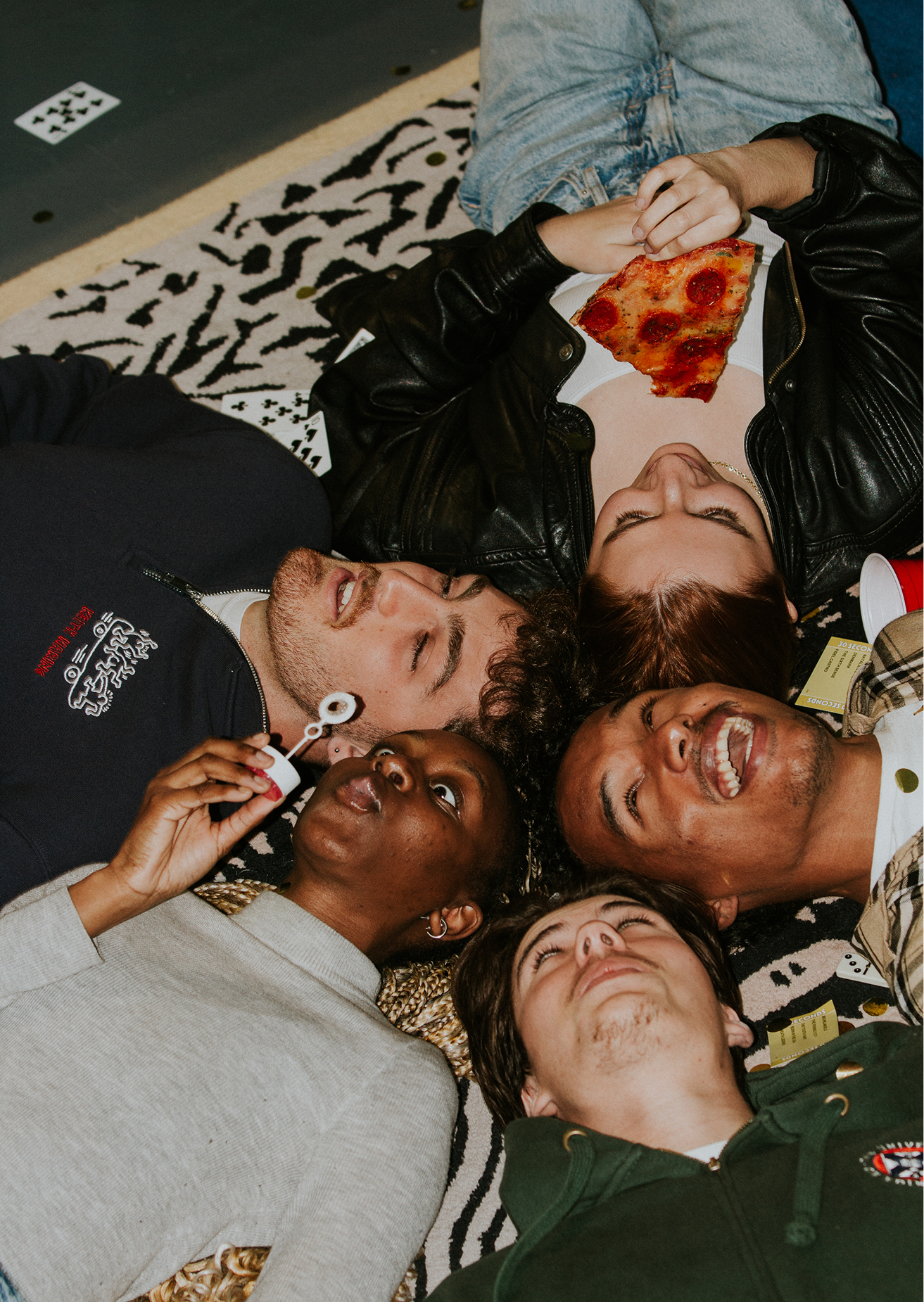
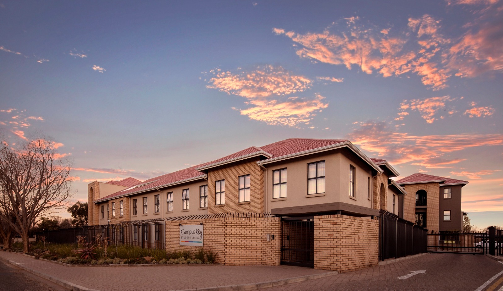
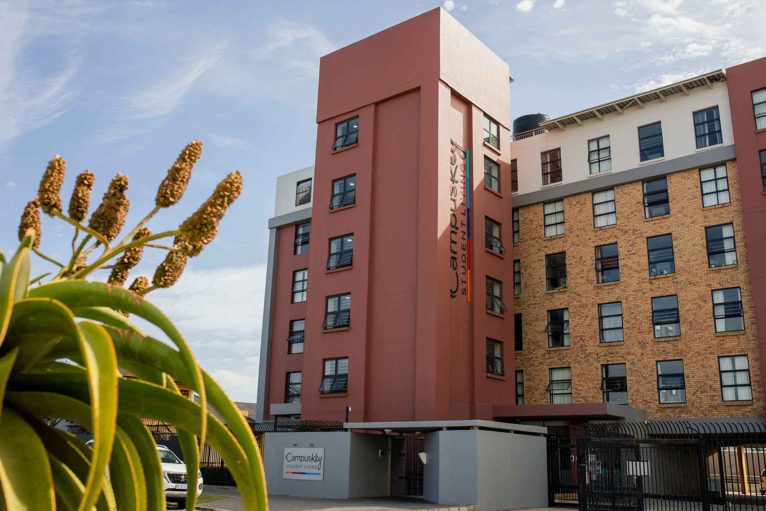
We believe that great design should be accessible to everyone. The new development, Bordeaux, is conveniently located in the heart of Stellenbosch. The impressive 4000 square metre development offers a meeting place for students, young professionals and foodies.
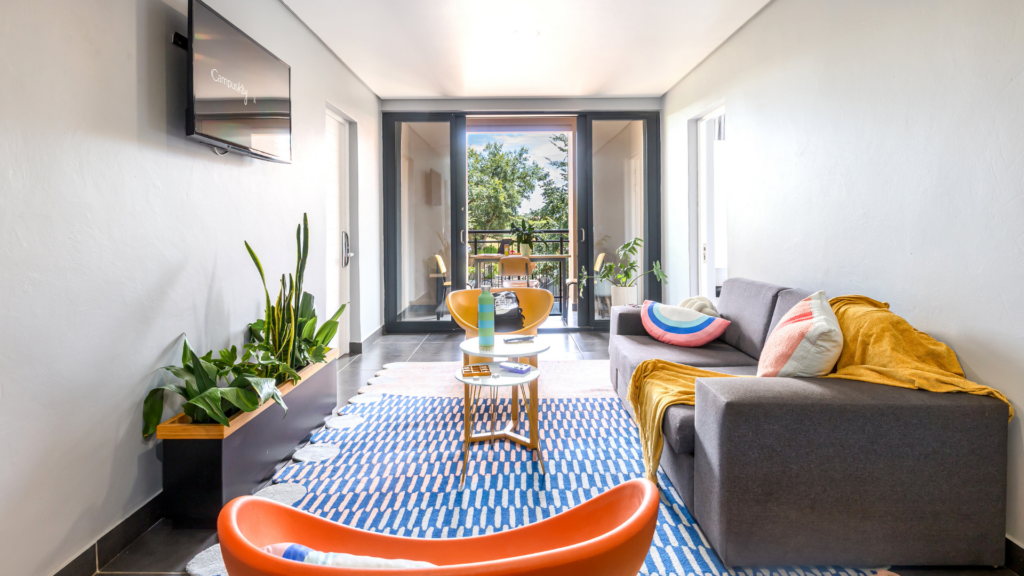
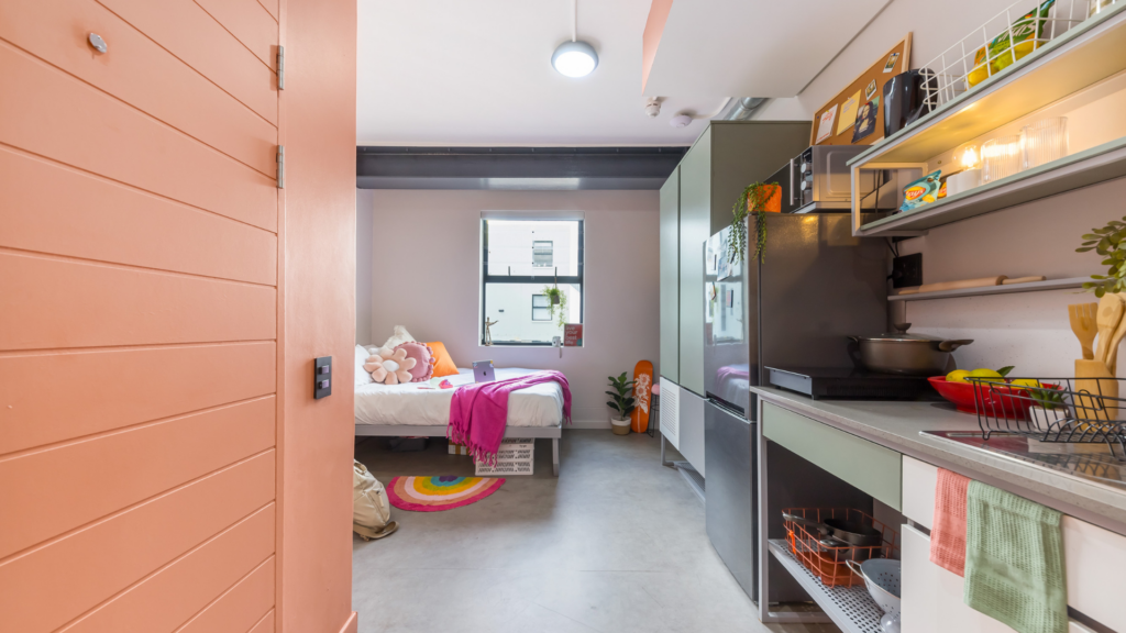
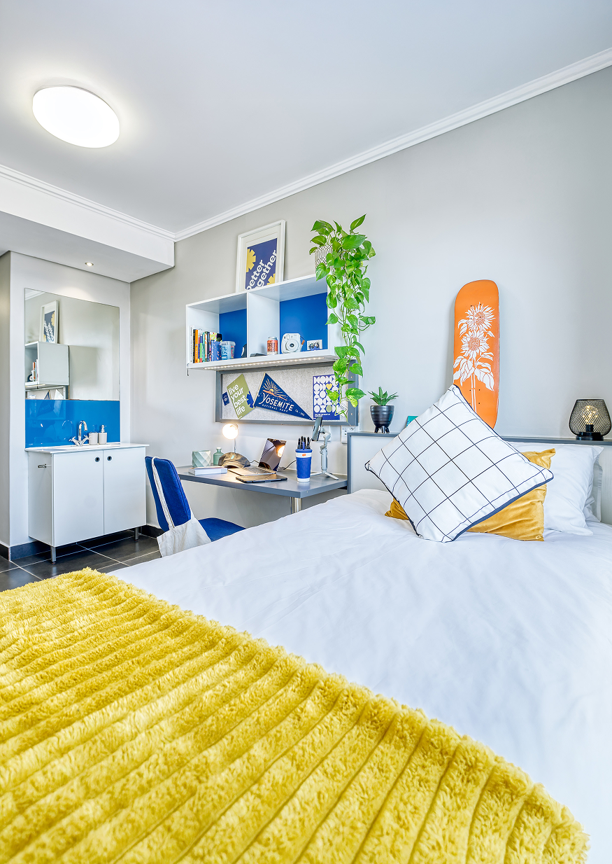
CampusKey is all about curating every aspect of our member’s experience. When looking at the interior design of our new building, our design team focused on enhancing productivity, collaboration, motivation and positivity. According to Celesté Havenga, our Architectural, experience and design expert, “Colour therapy was my main focus when selecting the colour palette for Bordeaux. In our increasingly stressful world, your private space needs to be a sanctuary for rest and healing, whereas our social spaces should leave you feeling stimulated and energized.”
Colour Therapy is based on the principles of psychology and research into colour and light, which investigates our individual and universal relationship with colour and how specific hues affect our physiological, mental, and emotional state.
“The specific colours and combinations were inspired by nature and chosen to create a sense of harmony and well-being, tailoring the space to meet our member’s personal needs. With colour therapy in mind and the vast implied wellness benefits, the colour palette was curated to increase energy levels in some spaces while promoting relaxation and restorative sleep, in others,” says Celesté.
BORDEAUX COLOUR PALETTE:
Blue is among the most calming colours in the palette. It relaxes the mind and slows down the heart rate.
Green offers a deep sense of renewal, self-control and harmony. It is soothing and restful on the eye. It can help you relax mentally as well as physically and helps alleviate depression, nervousness and anxiety.
Orange symbolizes sunshine and nature. Orange and all its shades pretty much have a positive effect on the psyche. It can stimulate hunger, enthusiasm and creativity.
Purple colour schemes work well in areas that inspire creativity. It is uplifting but also calming to the mind and nerves.
Celesté believes that “Choosing the right shade in terms of hue, light reflectance value and chroma plays an essential part in creating a sense of harmony. Finding a balance between colour harmony and what is currently trending plays a vital role in creating spaces which our members can relate to, spaces that inspire, push the boundaries and evokes a sense of joy.”
Bordeaux is planned to open its doors in early January 2022 and this will be the most innovative and exciting experience one can imagine.
Applications for our Bordeaux is officially open –
APPLY NOW